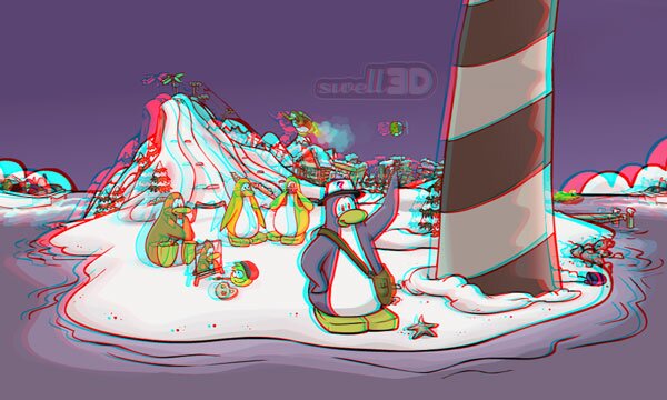
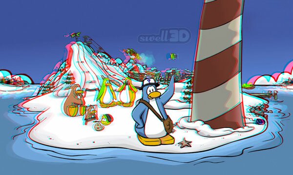
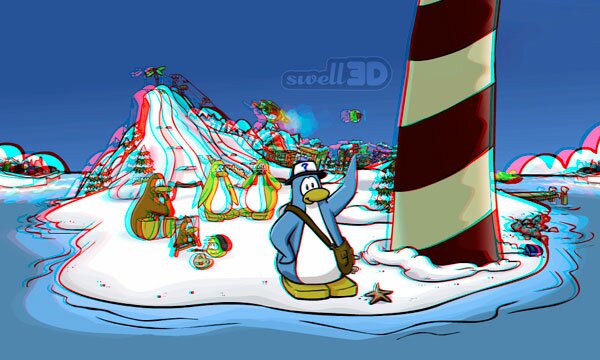
On July 8, 2008, I posted a color anaglyph illustration of Club Penguin, a 3D conversion from a 2D screenshot. It would have been a lovely image, except that the highly saturated primary colors caused extreme "retinal rivalry," which hurts the eyes and causes the brain to reject the image. I made it with no color adjustments, just the straight colors from the original flat image.
This retinal rivalry is unacceptable. To fix the problem, the colors must be adjusted. The challenge is to adjust the colors to cure the retinal rivalry, while keeping them as true to the original colors as possible. Not an easy task. So far, there have been 16 attempts to adjust the colors in this image, by seven different anaglyph experts. I created this page, so I could keep all the attempts in one place for easy comparison, and update it with new ones if anyone else wants to make the effort.
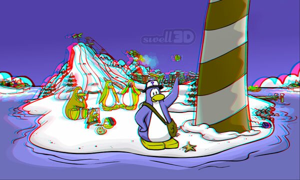
I made the adjustments for the image above, but I followed the precise formula prescribed by Peter Wimmer for "Optimized Anaglyphs," so Wimmer really deserves all the credit for the results.
The above image was adjusted by Louis Carlsson. He described his adjustment as "mixing the red and blue in the left image, and brightening the red in the right image."
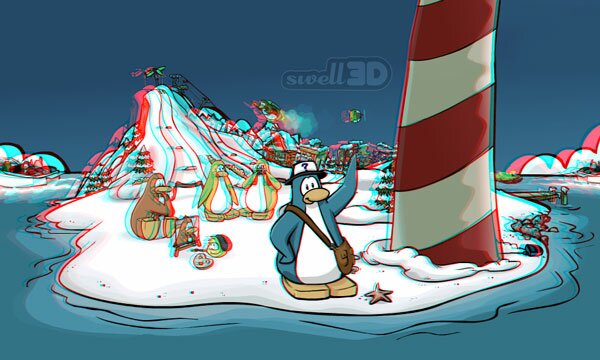
The above image was adjusted by Matthew Reeves, who goes by the name ByteMyzer on Flickr, using a method he calls "ChromaTune-3D," which he says "аppliеs spеciаlly cаlculаtеd аdditivе filtrаtiоn tо bаlаncе оbjеct rеgistrаtiоn in thе lеft аnd right chips tо rеducе rеtinаl rivаlry, аnd tо mаsk cоlоr crоsstаlk cоmmоnly fоund in thе Rеd lеns tо rеducе ghоsting."
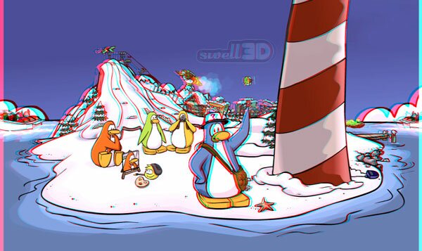
The image above was adjusted by Sharokh Dabiri, who used StereoPhoto Maker software to make a half-color anaglyph, then increased the color saturation of the left and right chips by 50 percent.
The image above was adjusted by Eric Dubois, with the least-squares algorithm (also called the "Dubois algorithm").
ADJUSTED BY MIKE BITTNER (9 IMAGES):
The next nine images were all generated by Mike Bittner, the first one using Cosima software, and the other eight using various settings on AnaBuilder software.
Generated by Cosima with anaglyph parameter set to Optimized Image with some added real colors:
AnaBuilder, preset in Sat6 menu option filter "Full":
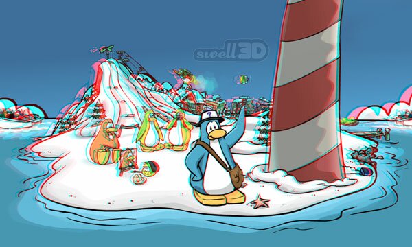
AnaBuilder, preset in Sat6 menu option filter "Compensated":

AnaBuilder, preset in Sat6 menu option filter "Partial":
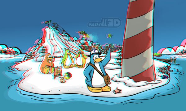
AnaBuilder, preset in Sat6 menu option filter "Half Color":
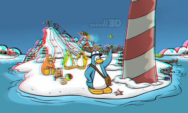
AnaBuilder, preset in filter menu Reds/Cyan Balance with pulldown options for half color anaglyph with strong blue color predominant:
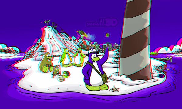
AnaBuilder, preset in filter menu Reds/Cyan Balance with pulldown menu for half color anaglyph with blue color predominant:
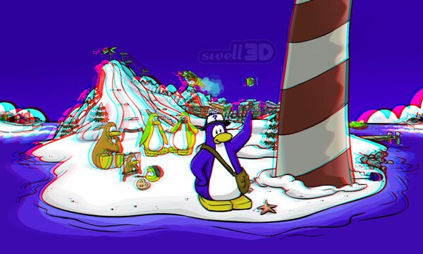
AnaBuilder, preset in filter menu Reds/Cyans Balance desaturation, red preset half color, cyan preset strong blue:
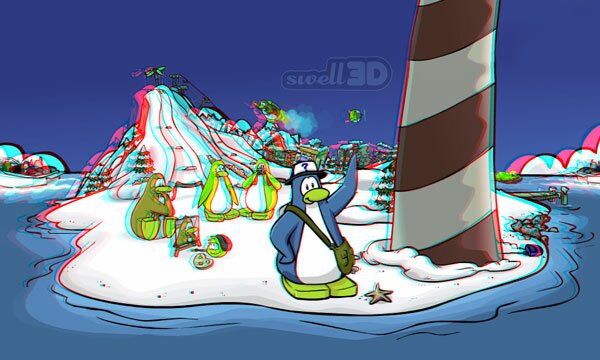
AnaBuilder, the Dubois anaglyph style found under "View":
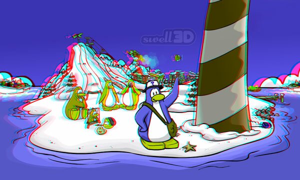
I found it curious that AnaBuilder's "Dubois" anaglyph does not exactly match the "Dubois" anaglyph made by Eric Dubois. A comment by Dr. Dubois cleared up my confusion.
ADJUSTED BY JAY GHARAVI (2 IMAGES):
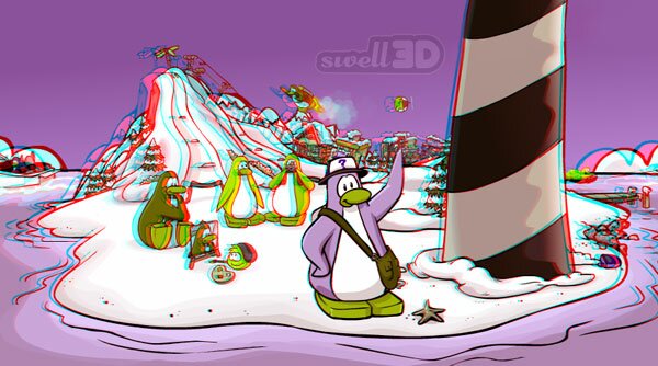
The image above was adjusted by Jay Gharavi, who explains: "I desperately tried to preserve some red in this anaglyph. In Photoshop CS3, I desaturated the blues and cyans by about 50% in the left chip, and the reds by about the same amount in the right chip. I did switch to Lab mode before the adjustments."
He then made a second one, applying Photoshop's "Photo Filter" to the left and right views, at 75% strength, with "Preserve Luminosity" checked. He also floated the window for this one, rather than aligning the images at the window corners.
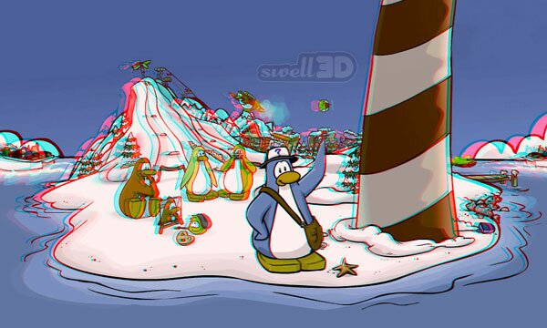
The image above was adjusted by Dan Ridley-Ellis, who says "it involved changing the shape of the R, G and B histograms of the L and R views and then using using the saturation blend mode to overlay the modified image over the original. The intended effect was to clip the highest R, G and B values, muddy the purest R, G and B colours, and yet leave the the rest of the colours more or less intact. It was literally five minutes of tinkering while wearing the glasses until I got an image that had tolerable retinal rivalry. Then I made the anaglyph."
Every one of these is an improvement on my original, and they all cure the retinal rivalry problem. But they don't all preserve the original colors equally well; some do a better job than others. You are of course free to form your own opinions, or to try to make an even better adjustment than those so far submitted. If you think you are up to the challenge, download the left and right images, and get to work.

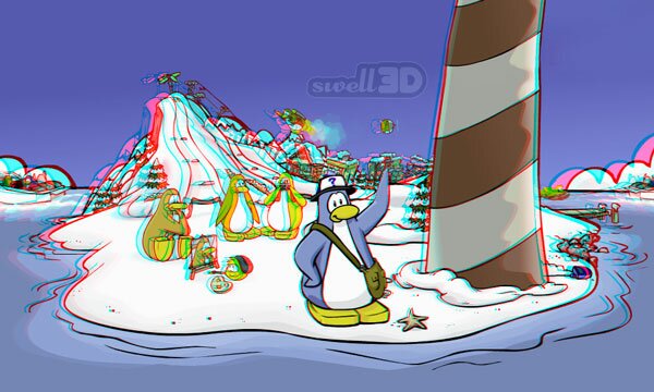

Hey Sean!!! hello, i need help with something… =) i hope you can help me. i just saw this work with the penguins and it says that it came from a 2d image…I need to make a 3d image from a 2d picture that i have of a tape dispenser i did but i dont have the physical object with me anymore, so i don’t know how to do that. Can you help me….???? Pleaseee Catalina